January 15, 2020
DOWNLOAD PERSPECTIVE
Lyell Wealth Management invests substantial resources in proprietary research which helps us decipher real economic and market data apart from the sensationalist financial media. We periodically publish a Snapshots issue that compiles charts and tables that we think are interesting. There may not necessarily be a common thread tying them together, but they provide insight into the factors that Lyell Wealth Management incorporates into its investment process.
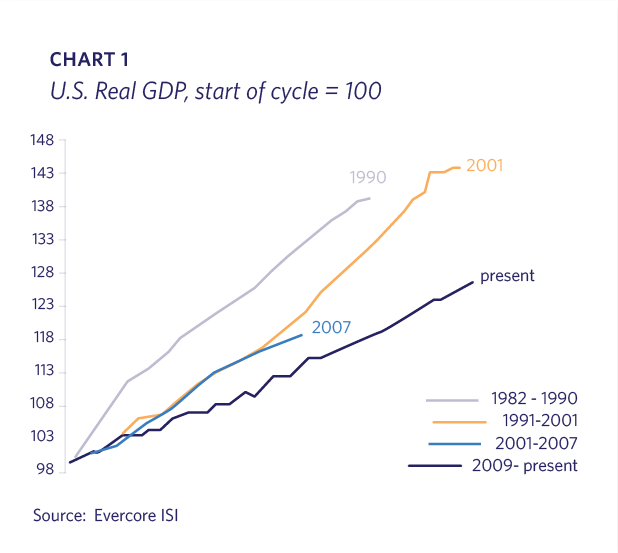
Although the U.S. economic expansion is the longest on record, its moderate pace has produced significantly lower cumulative GDP versus the cycles in the 1980s and 1990s; we’ve taken longer to not get as far. Since economic cycles don’t have an expiration date and the Federal Reserve is committed to easy money for the foreseeable future, this cycle may have more longevity than some expect (Chart 1).
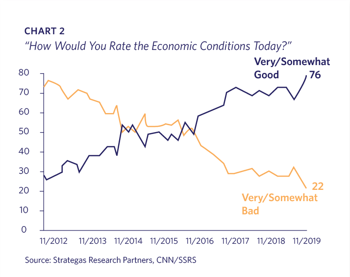
Despite recently exiting its third “mini-recession” since the Global Financial Crisis (ìGFCî), the U.S. economy received its highest ratings in almost two decades in a December CNN/SSRS poll. Positive attitudes toward economic conditions have climbed impressively in recent years (Chart 2).
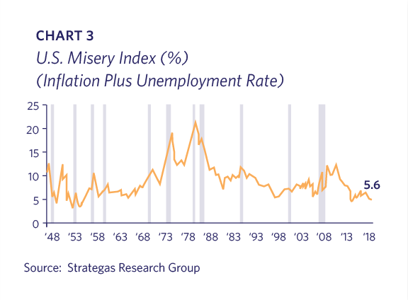
The high ratings are likely due to the “Misery Index” (inflation plus unemployment rate) being at the lowest level since Eisenhower was President (Chart 3).
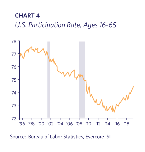
The strong employment environment continues to pull workers into the labor market as indicated by an increasing participation rate (Chart 4).
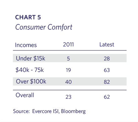
It is not just the wealthy who are confident. Evercore ISI points out that “the rising tide is lifting all boats.” Those with “Middle-America” incomes of $40k-$75k poll their consumer comfort at approximately the same level as the overall average. There has been huge improvement across all income levels over the past eight years (Chart 5).
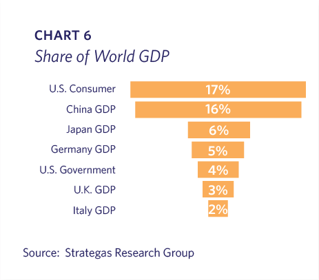
It is well known that consumers represent more than two-thirds of the overall U.S. economy, but less recognized is that the U.S. consumers’ share of the World GDP is larger than China’s total GDP (Chart 6).
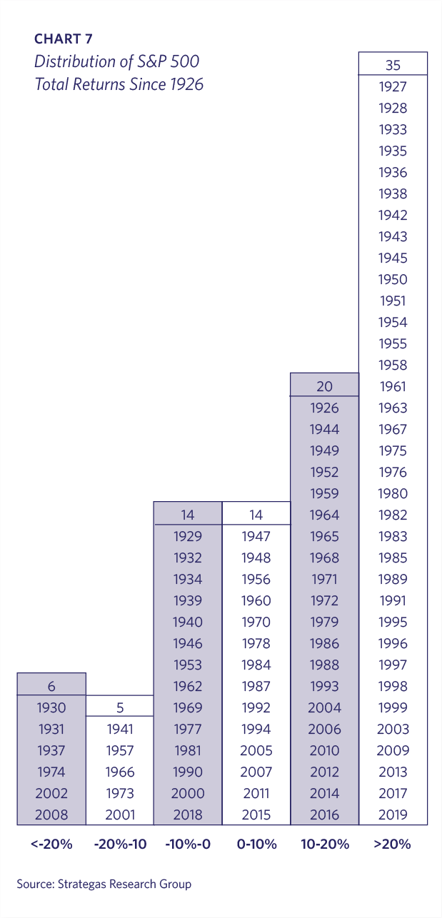
Lyell Wealth Management views a mid-to-high single digit annualized return as a realistic long-term expectation from a stock portfolio. It is interesting to note that in the 94 years since 1926, the S&P 500 has only had 14 years (15% of the observations) where the annual total return was in positive single-digits between 0%-10%. An investor rarely earns the “average” return in any given year and will experience volatility along the way to the long-term annualized return (Chart 7).
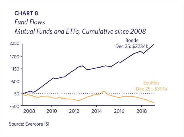
Despite the U.S. market’s impressive rise since the GFC, capital has actually come out of U.S. stock mutual funds and ETFs while there has been a huge influx into bond funds. Since 2008, the net difference has been over $2.6 trillion (Chart 8).
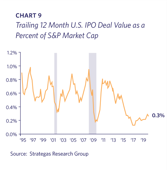
IPO volume remains paltry as companies stay private longer and many prospects are acquired. The dollar value of IPO companies as a percentage of S&P market capitalization is near the lows hit during the GFC. These statistics aren’t indicative of “irrational exuberance” – a phrase coined by Alan Greenspan to describe the dot.com bubble in the 1990s (Chart 9).
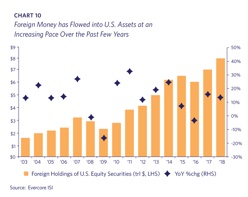
Corporate share repurchases have been unprecedentedly large this cycle. Another significant source of demand has been foreign buyers. International investors now hold approximately $7.5 trillion in U.S. equities, representing roughly 15% of the domestic stock market (Chart 10).
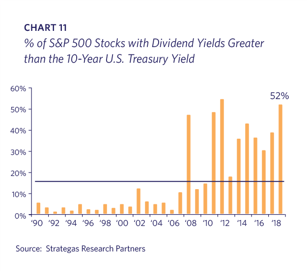
Dividend yields are more attractive in a very low interest rate environment. Whereas S&P 500 dividend yields haven’t varied that much in recent decades, bond yields have dropped significantly. Approximately half of the S&P 500 stocks have dividend yields higher than the 10 year Treasury Note, and Treasuries offer a 2% rate premium over German or Japanese government bonds (Chart 11).
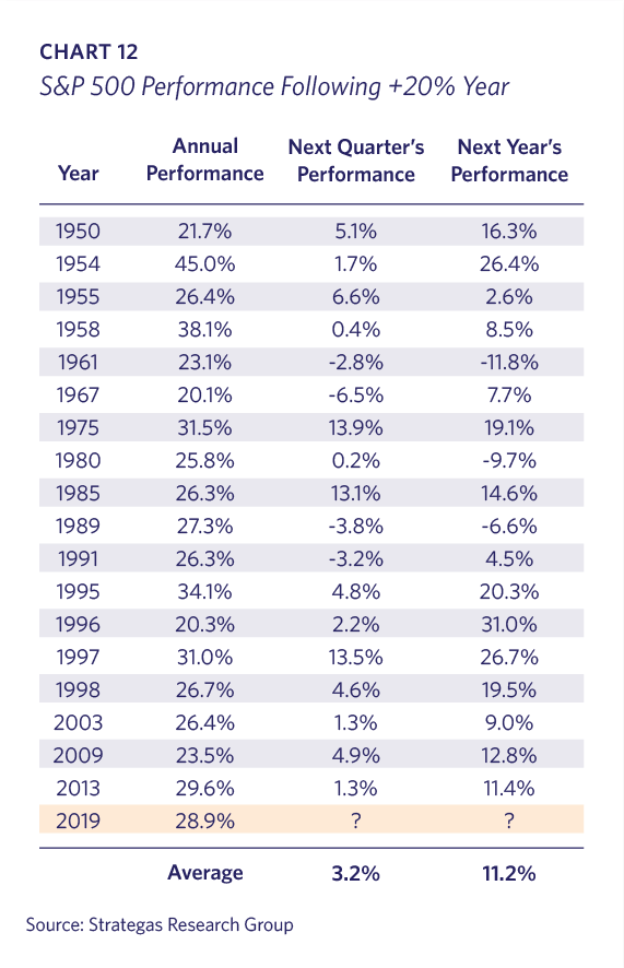
Many investors expect mean reversion following big return years. In fact, history has shown that the stock market typically outperforms in the following year. The S&P 500 average return of 11.2% in these subsequent years is higher than the 8.9% historical average. In the 19 years since 1950 that the S&P 500 has increased 20% or more, there have been only three instances in which the index declined the following year (Chart 12).
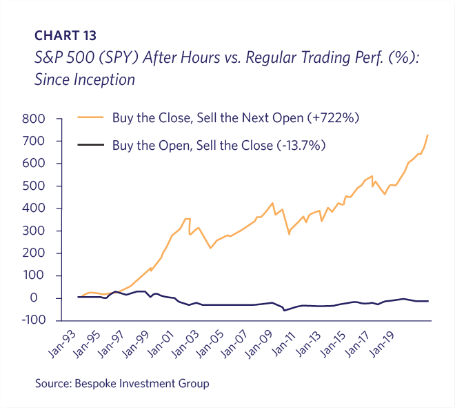
Since the S&P 500 ETF (ticker: SPY) began trading in 1993, over 100% of its gains have come when the U.S. markets are closed! As of early December 2019, if an investor bought the SPY at the U.S. market close and sold at the next morning’s open each day, the cumulative gains would have been 722% since inception. However, if the investor bought at the open and sold at the close, the position would have lost almost 14% over the same almost three decades! The NASDAQ 100, Russell 2000 and even Gold ETFs all show a similar pattern. This certainly isn’t an endorsement of day-trading (Chart 13).
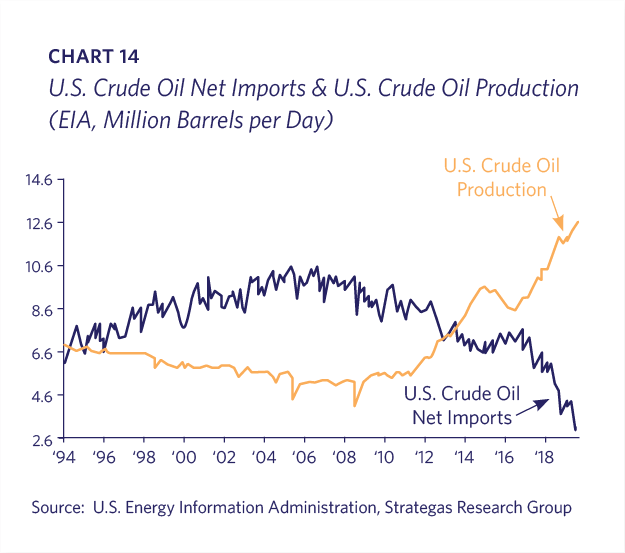
The U.S. has moved towards energy independence at a rapid pace hard to appreciate. Crude oil production has spiked along with the commensurate drop in imports in only one decade (Chart 14).
Summary
The above data informs Lyell Wealth Management’s investment strategy and asset allocation along with many other inputs. Our clients’ equity positions are primarily focused on well-managed companies with secular growth opportunities that don’t depend on strong cyclical prosperity to succeed. We have held a strong U.S.-centric bias in recent years due to our view that most of the global disruptive and innovative companies are listed and headquartered domestically. Although we would not be surprised to see some long overdue catch-up by international stock markets in the coming year, as managers of mostly taxable accounts, this kind of short-term trade is difficult to implement. Our clients’ stock holdings are complemented by fixed income, private real estate and alternative investments, as appropriate. We are focused on achieving the right balance of growth, liquidity and capital preservation for each client.